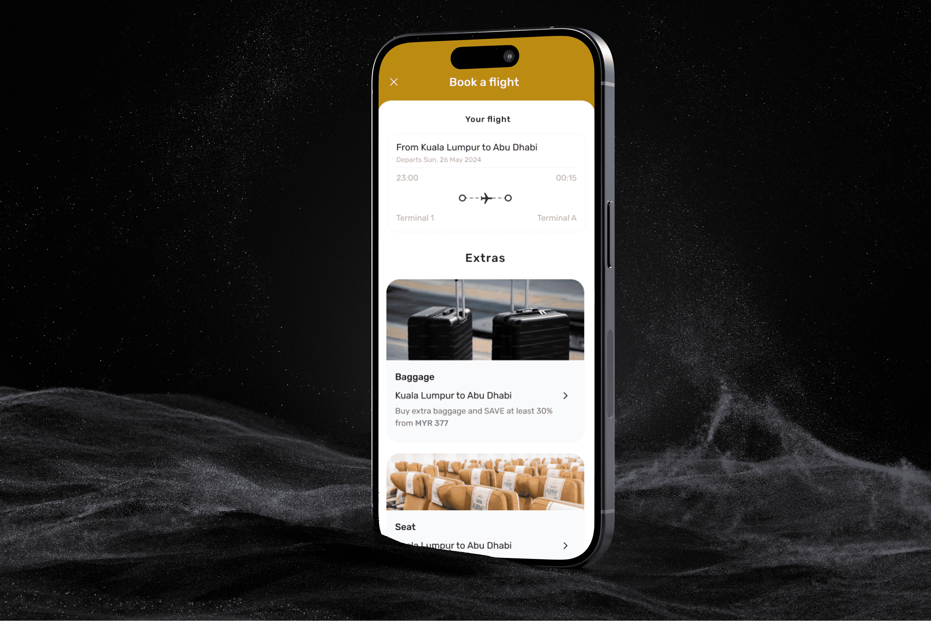
Optimising Etihad's ancillary booking experience aims to improve user experience (UX) and increase conversion rates. This involves refining the booking process to make it more user-friendly and efficient, ultimately encouraging more customers to purchase additional services.
Industry
Client
Service
Timeline
To explore opportunities to enhance the digital booking experience for ancillary products in current Etihad’s app.
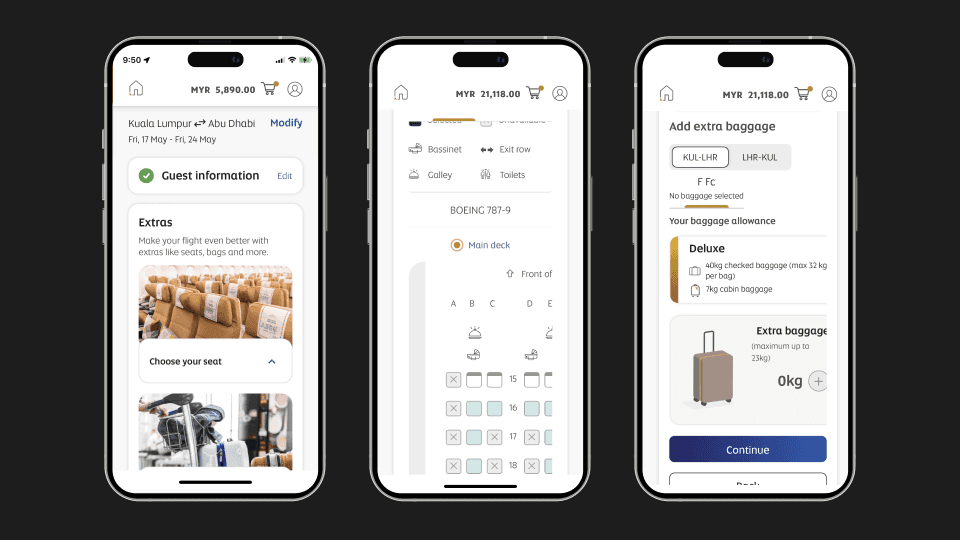
Focus on 3 top screens:
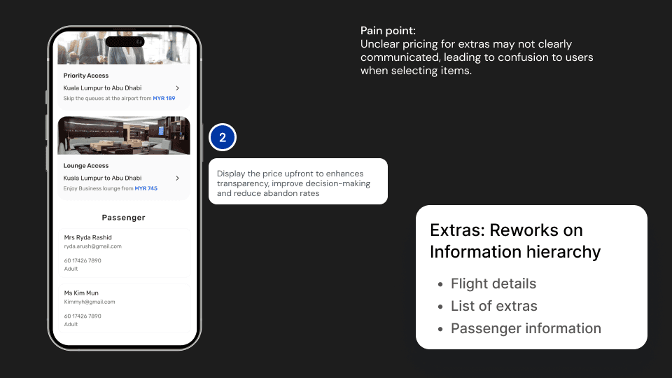
Extras
Seat
Baggage
How might we enhance the digital booking experience for ancillary products offered by Etihad Airways to maximize user satisfaction and increase conversion rates?
User Research
Understanding Customer Wants, Needs, and Expectations in the Current Flow
To gain a deeper insight into customer frustrations, pain points, and expectations, we conducted a series of activities:
Current Frustrations and Pain Points: What are the primary frustrations and pain points experienced by customers?
Real Wants and Needs: What do customers truly want and need from the product?
To address these questions, we undertook the following activities:
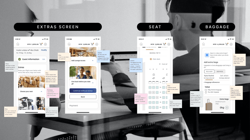
Guerilla Testing among Peers: This quick, informal testing method provided immediate feedback on user interactions with the current flow.
5 User Interviews: In-depth conversations with users helped us identify their real wants, needs, and the challenges they face.
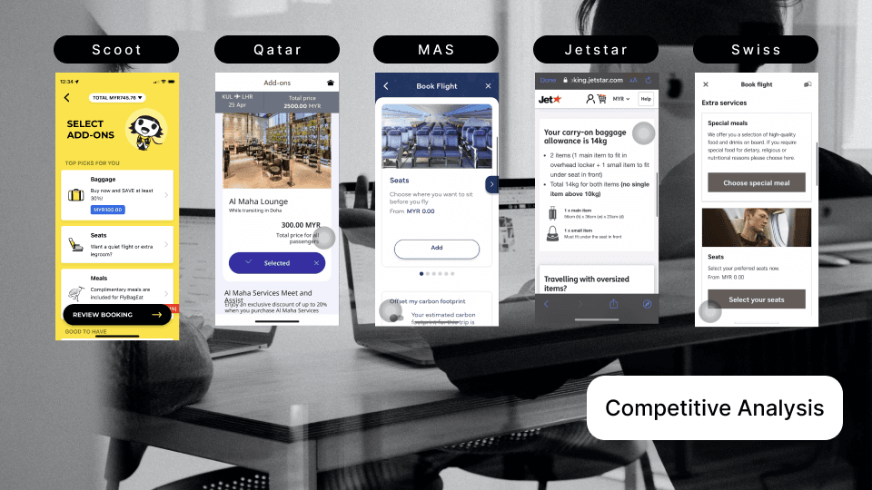
Competitor Analysis Mapping: By examining competitor products, we identified gaps and opportunities to improve our offerings.
These activities have provided us with a comprehensive understanding of the current customer experience and the areas that need enhancement.
Insights
(4/5) users able to added extras and proceed to payment
(3/5) users encounter difficulties navigate through adding extras products.
(2/5) users continue without extras
Complex Navigation: Users encounter difficulties navigating through the app to access extras services.
Unclear Pricing: Pricing for extras services may not clearly communicated, leading to confusion to users when selecting items.
Limited visibility and usability issue.
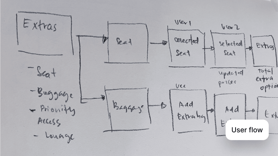
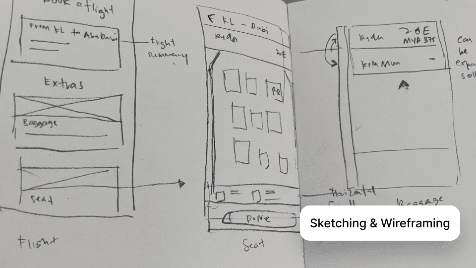
Crafting user flow and wireframing.
These methods allow to explore diverse ideas, visualize design concepts, and outline the basic structure and functionality of potential solutions.
The Solutions
Translated the wireframing into UI designs
Prototype
Impact
The impact to the users and business:
Increased satisfaction and loyalty.
Increased conversion rates.
Increased revenue opportunities.
Detailed case study can be found on Medium
